


Style Guide
Every component, in one place.
The reusable Sanaira system: tokens, type, surfaces, product frames, forms and motion. Use it as the reference when customising or adding pages.
Components
Logo
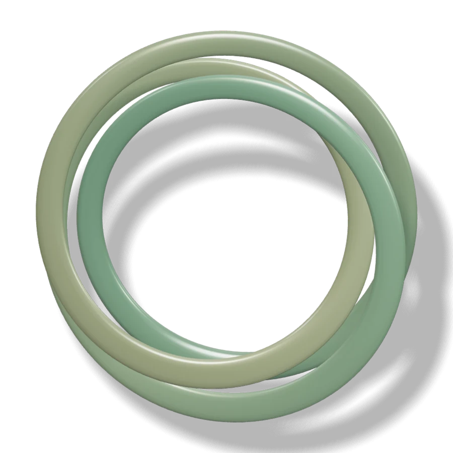
The Care Weave mark with the Manrope wordmark. Light and dark marks swap automatically.
Color tokens
Defined in src/styles/tokens.css for light and dark themes. Section tones may override them locally.
- Ink
--inkPrimary text and icons - Muted
--mutedSupporting text - Surface
--surfacePage background - Panel
--panelRaised surfaces, inputs - Mineral teal
--tealAccents, active states, editorial italics - Sunlit bronze
--accentLabels, numerals - Sand
--sandWarm highlights - Button
--buttonPrimary action fill - Line
--lineHairlines and borders - Calm blue
--infoInformation states - Clay red
--dangerErrors - Focus
--focusKeyboard focus ring
Section tones
Art-directed static environments with paper grain. Use <Section tone="…">.
- Hero meshHomepage, auth and wizard only (animated)
tone-hero - SageIndividuals, calm intros
tone-sage - MistBrokers, guidance
tone-mist - SandTeams, comparison
tone-sand - DawnTestimonials, articles
tone-dawn - IvoryReading, FAQ, legal
tone-ivory - ForestDark statement sections
tone-forest
Typography
Manrope for display, Instrument Serif for editorial italics, DM Sans for body and interface text.
Coverage that fits the life you live.
Better choices in three parts.
Understand your care
Most coverage journeys begin with premiums. Sanaira begins with the care you already use.
Section label
Buttons & links
Containers stay still; arrows move only in the direction they point. Hover any example.
Editorial blocks
Hairlines, numerals and leaf badges — never generic boxed card grids.
Pillars
Open columns for three or four ideas.
Balanced
Divided by vertical hairlines.
Numbered
Editorial numerals in Instrument Serif.
Ledger row
Icon rows for terms and dimensions.
Second row
Pass numbered for a true sequence.
- Checklist item. With supporting text.
- Short item
- Audiences
- 3
- Wizard steps
- 7
- Template pages
- 40
- Rail
Answer
Step one.
Compare
Step two.
Decide
Step three.
Product screenshots
Product visuals are real screens of the Sanaira Coverage Workspace app, captured with scripts/capture-app-screens.mjs and shown with ProductScreenshot (src/components/app).


Forms
Labels, hints, optional markers and friendly validation. Leave a field to see its error state.
Helper text sits below.
Includes a show/hide control.
Accordions & tabs
Answers expand below the question with a rotating plus.
Keyboard: Tab to a question, Enter or Space to toggle.
Arrow keys move between tabs.
Second panel.
Underline style for denser contexts.
Second panel.
Wizard controls
Progress, stepper and budget slider from the Find Coverage wizard.
- Who
- Snapshot
- Location
- Care
- Budget
- Preferences
- Preview
Alerts
Neutral guidance or demo notices.
A completed action.
Something needs attention.
A problem to fix before continuing.
Care Weave
One object, two behaviours: the homepage journey (scroll-driven) and the still composition (idle self-turn only).
Motion & reduced motion
Homepage
Scroll-driven Care Weave journey, animated hero mesh. Reduced motion shows composed still chapters.
Content pages
One-time copy reveals, hover arrows, idle weave stills at a slow 44–64 s turn. Paused off-screen.
Auth & wizard
Calm mesh field and idle weave; wizard steps slide horizontally inside a stable card.
Reduced motion
All transitions and idle motion stop; content is fully visible without animation.
Motion durations and easing live in tokens.css (--ease-care) and component stylesheets.